
Crafting Delight: Key Elements for Winning UI Design
In the dynamic landscape of digital products, a compelling User Interface (UI) is no longer a luxury; it’s the bedrock of user satisfaction and business success. A well-crafted UI doesn’t just look good; it feels intuitive, guides users seamlessly, and reinforces brand identity. Several key elements work in concert to achieve this winning formula. Let’s explore the significance and best practices for Spacing, Colors, Typography, and UI Visuals.
1. The Breath of Fresh Air: Mastering Spacing
Often underestimated, spacing (also known as white space or negative space) is the unsung hero of UI design. It’s the empty canvas around and between elements that provides visual breathing room, improves readability, and establishes hierarchy.
Why is Spacing Important?
- Enhances Readability: Adequate spacing between lines of text, paragraphs, and elements prevents visual clutter, making content easier to scan and digest.
- Improves Comprehension: By creating clear visual separation, spacing helps users distinguish between different sections and understand the relationships between elements.
- Establishes Hierarchy: Strategic use of spacing can guide the user’s eye, emphasizing important elements and creating a clear visual flow.
- Creates Visual Appeal: Generous white space contributes to a clean, modern, and sophisticated aesthetic, reducing cognitive load and making the interface feel less overwhelming.
How to Improve UI with Better Spacing Practices:
- Embrace the Grid System: A well-defined grid provides a structural framework for consistent spacing and alignment across the interface.
- Establish a Spacing Scale: Define a set of consistent spacing values (e.g., 8px, 16px, 24px) and adhere to them throughout the design to create visual harmony.
- Pay Attention to Micro-Spacing: The subtle spacing around individual elements like icons and buttons significantly impacts their clarity and touch targets. Ensure sufficient padding for comfortable interaction.
- Consider Proximity: Group related elements closely together using less spacing to visually connect them and indicate their association.
- Don’t Be Afraid of White Space: Resist the urge to fill every pixel. Embrace negative space as an active design element that enhances clarity and focus.
2. Painting with Purpose: The Power of Color
Color is a potent tool in a UI designer’s arsenal, capable of evoking emotions, conveying meaning, and reinforcing brand identity. Thoughtful color choices can significantly impact user perception and engagement.
Why are Colors Important?
- Evokes Emotion and Mood: Different colors are associated with various emotions (e.g., blue for trust, red for urgency), influencing the user’s overall experience.
- Communicates Meaning: Colors can be used to indicate status (e.g., green for success, red for error), provide visual cues, and highlight interactive elements.
- Reinforces Brand Identity: A consistent color palette strengthens brand recognition and creates a cohesive visual experience across all touchpoints.
- Improves Accessibility: Careful color selection ensures sufficient contrast between text and background, making the interface usable for individuals with visual impairments.
How to Improve UI with Better Color Practices:
- Develop a Cohesive Color Palette: Start with your brand’s primary color and build a complementary palette of secondary and accent colors. Consider using color theory principles for harmonious combinations.
- Establish Clear Color Meanings: Define how different colors will be used to convey specific information or actions within the interface and maintain consistency.
- Prioritize Accessibility: Adhere to WCAG (Web Content Accessibility Guidelines) contrast ratio requirements to ensure readability for all users. Utilize color contrast checkers to verify compliance.
- Use Color Sparingly and Strategically: Avoid overwhelming the user with too many colors. Use accent colors to draw attention to key elements and maintain a balanced visual hierarchy.
- Consider Cultural Connotations: Be mindful that color meanings can vary across cultures and ensure your choices are appropriate for your target audience.
3. The Voice of Your Interface: The Art of Typography
Typography is more than just choosing fonts; it’s about crafting a visual language that enhances readability, establishes tone, and reinforces brand personality. Well-chosen and thoughtfully implemented typography can significantly elevate the user experience.
Why is Typography Important?
- Ensures Readability and Legibility: Selecting appropriate font families, sizes, line heights, and letter spacing is crucial for comfortable reading and content comprehension.
- Establishes Visual Hierarchy: Varying font weights, sizes, and styles helps users quickly identify headings, subheadings, and body text, creating a clear visual structure.
- Conveys Brand Personality: Different fonts have distinct personalities (e.g., serif fonts can feel traditional, sans-serif fonts can feel modern), contributing to the overall brand voice.
- Improves User Experience: Well-structured typography reduces cognitive load, making it easier for users to navigate and interact with the interface.
How to Improve UI with Better Typography Practices:
- Choose Legible Font Families: Opt for fonts that are easy to read across different screen sizes and resolutions. Consider factors like x-height and open forms.
- Establish a Typographic Hierarchy: Define clear styles for headings, subheadings, body text, and captions using variations in size, weight, and color.
- Pay Attention to Line Length and Line Height: Aim for optimal line lengths (around 45-75 characters for body text) and appropriate line heights (typically 1.5x the font size) for comfortable reading.
- Maintain Consistent Font Usage: Limit the number of font families used to maintain visual harmony and avoid overwhelming the user.
- Test Your Typography: Preview your designs on different devices and screen sizes to ensure readability and visual appeal across various contexts.
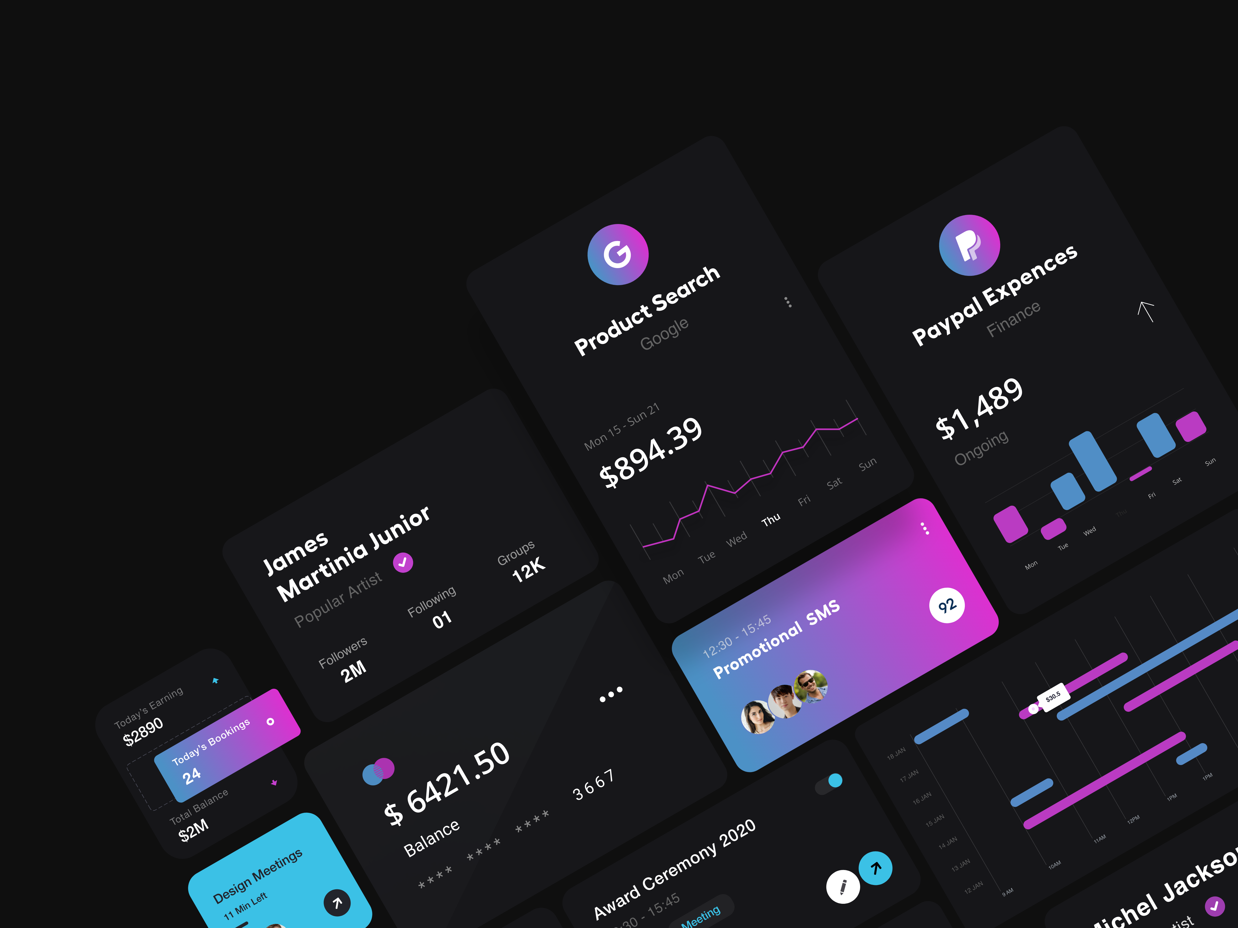
4. Engaging the Senses: The Impact of UI Visuals
UI visuals encompass a wide range of elements, including icons, illustrations, photography, and animations. When used effectively, they can enhance communication, provide visual interest, and improve user engagement.
Why are UI Visuals Important?
- Enhance Communication: Icons and illustrations can convey complex information quickly and intuitively, often transcending language barriers.
- Add Visual Interest and Personality: High-quality visuals can make the interface more engaging, memorable, and reflective of the brand’s personality.
- Guide User Interaction: Visual cues like directional arrows or highlighted buttons can guide users through tasks and improve usability.
- Provide Feedback and Delight: Subtle animations and transitions can provide visual feedback on user actions and add a touch of delight to the interaction.
How to Improve UI with Better Visual Practices:
- Maintain Consistency: Ensure that the style and quality of your visuals are consistent throughout the interface and align with your brand guidelines.
- Prioritize Clarity and Purpose: Every visual element should serve a clear purpose, whether it’s conveying information, guiding interaction, or enhancing aesthetics. Avoid decorative elements that add unnecessary clutter.
- Optimize for Performance: Large or unoptimized images and animations can slow down loading times and negatively impact the user experience. Optimize all visual assets for web and mobile.
- Consider Accessibility: Provide alternative text for images to ensure they are accessible to users with visual impairments. Be mindful of color contrast in visual elements.
- Use Animations Thoughtfully: Animations should enhance the user experience, not distract from it. Keep them subtle, purposeful, and performant.
The Symphony of Elements
Ultimately, winning UI design is not about excelling in just one of these areas but rather about orchestrating them harmoniously. When Spacing, Colors, Typography, and UI Visuals work in synergy, they create an interface that is not only aesthetically pleasing but also intuitive, accessible, and effective in achieving its goals. By understanding the importance of each element and embracing best practices, designers can craft digital experiences that truly delight and empower users.
Want Amazing Design for Your Digital Product ?